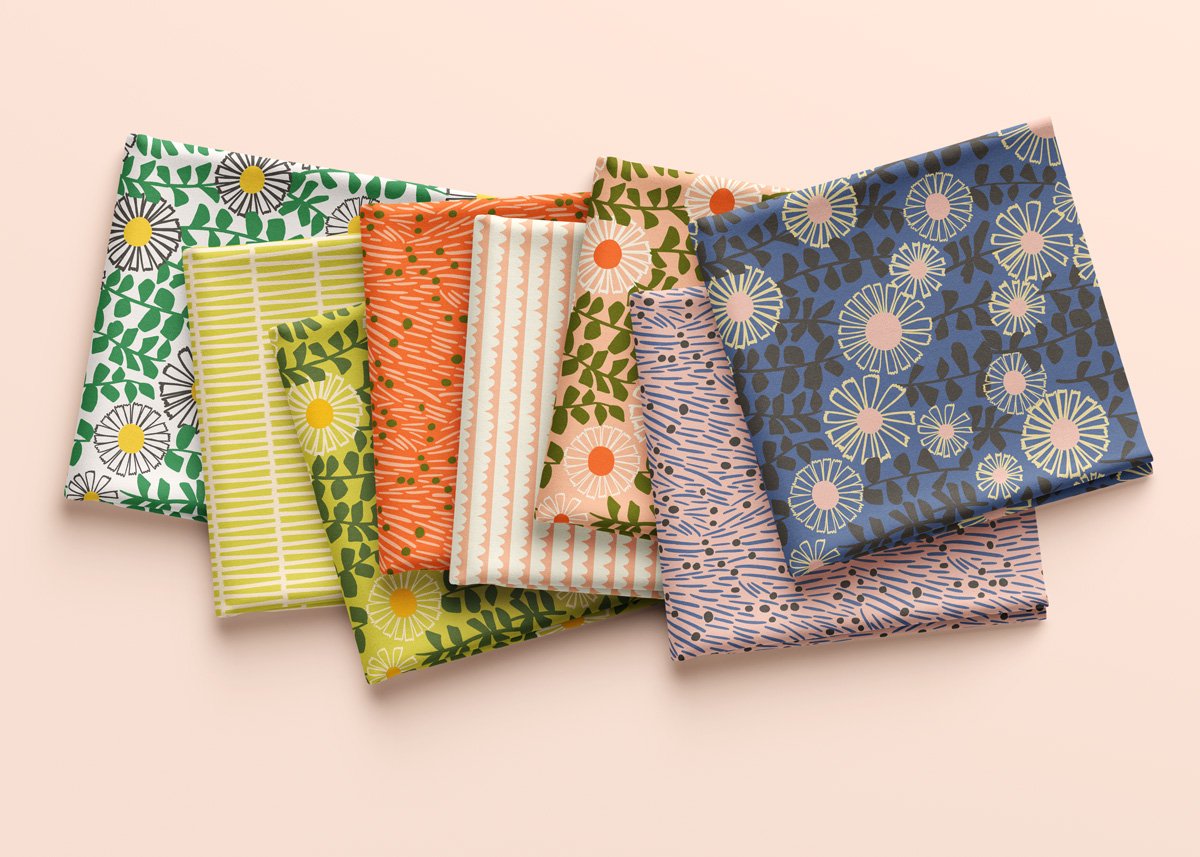
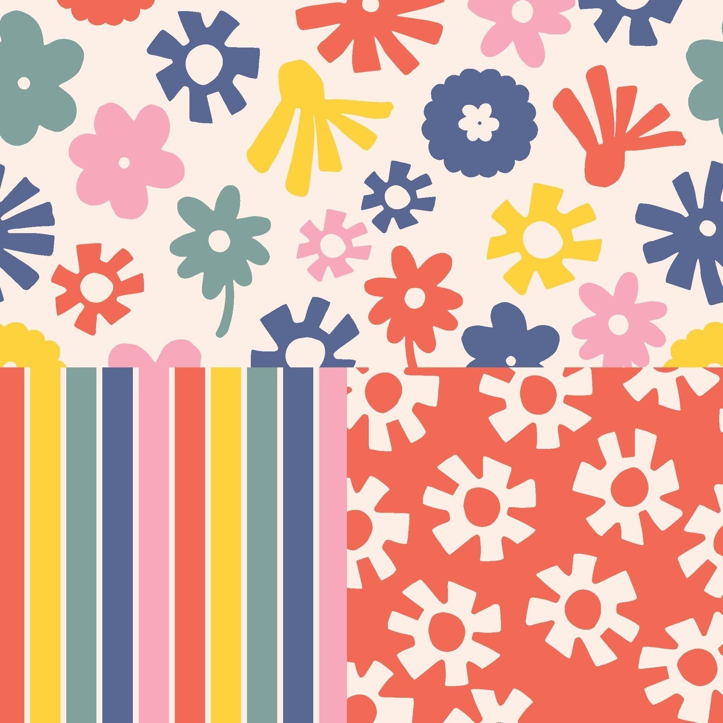
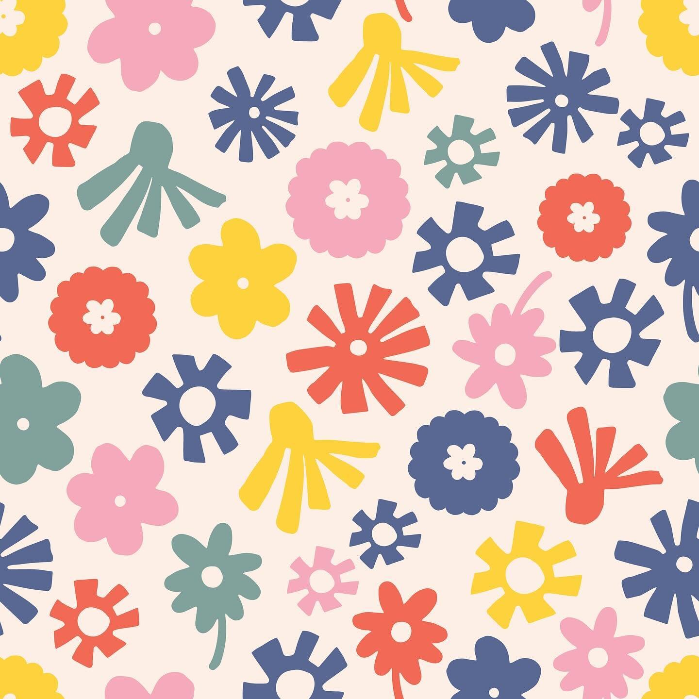
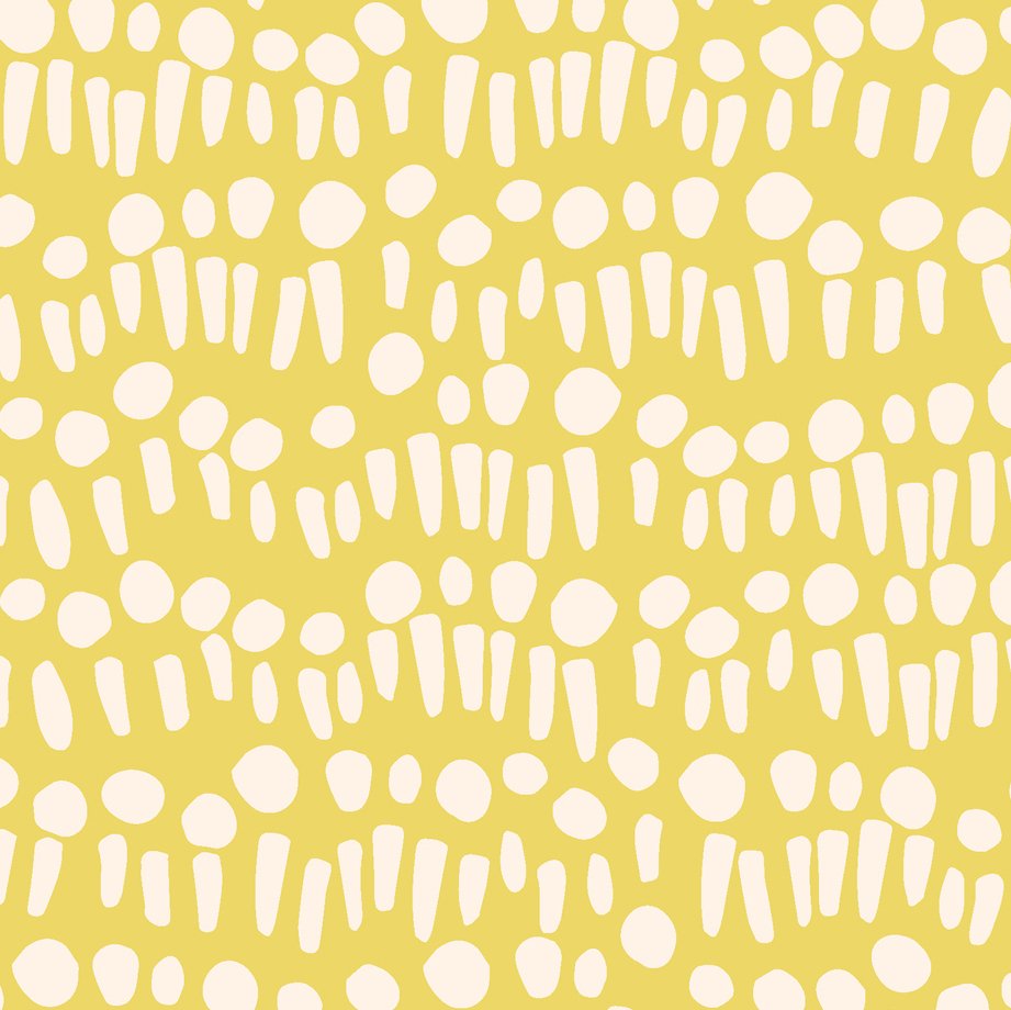
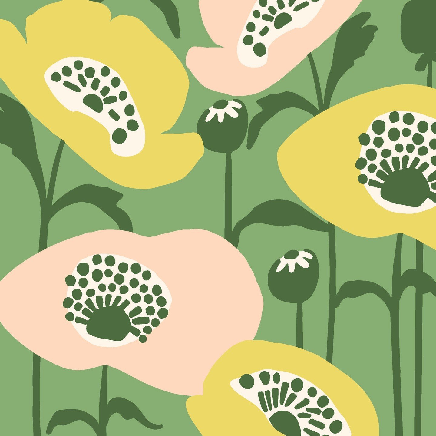
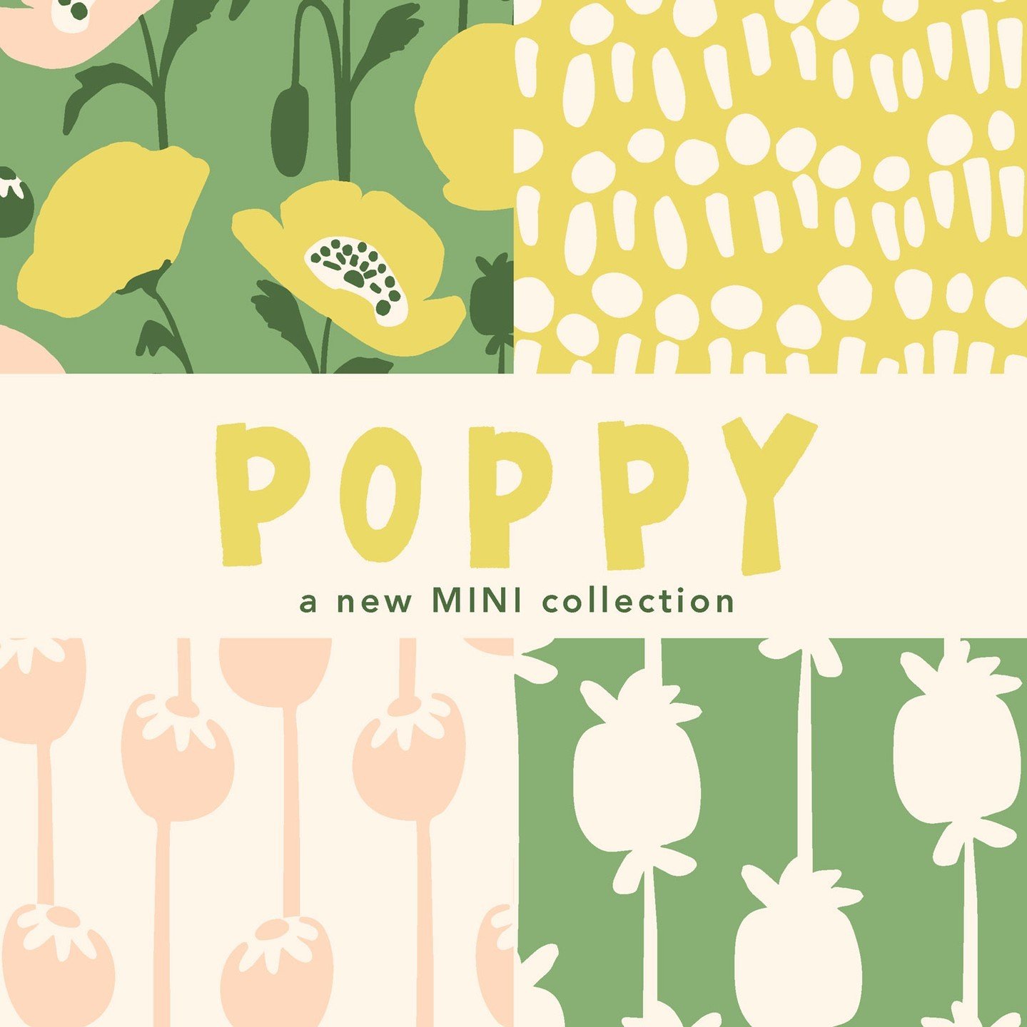
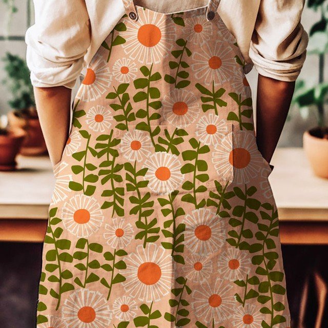
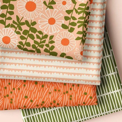
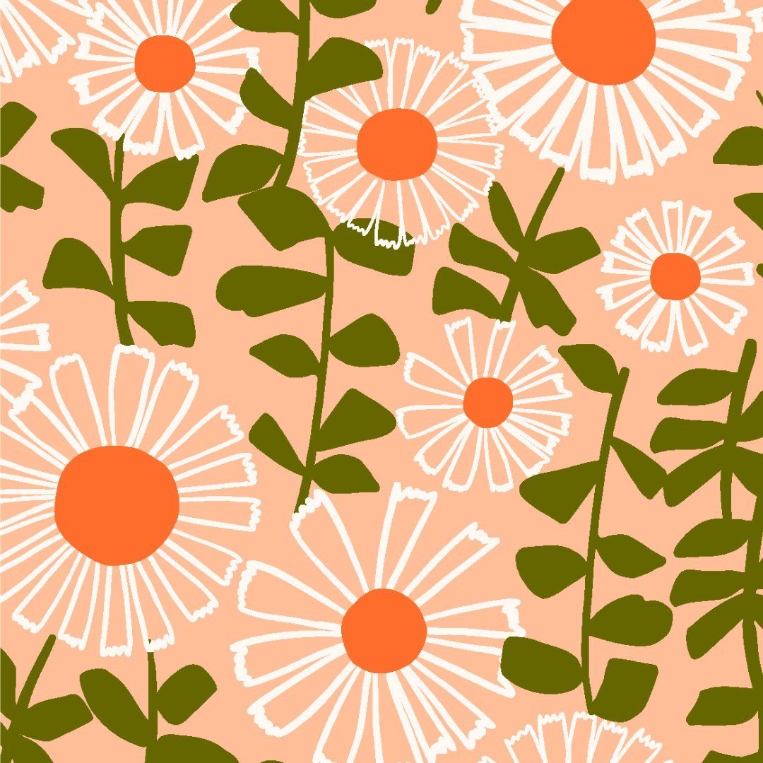
I am very excited to share with you some of my new pattern design work. This is my new DAISIES collection. This past fall, I started to design with more of a collection mindset which means creating a “hero” design and a few supporting patterns to accompany the hero pattern. Initially it was challenging but now I am finding it thoroughly enjoyable. I still have lots to learn and figure out but I believe I’m getting the hang of it, and now I love creating the coordinating patterns.
Once the design is figured out, the next challenge for me was to create different color combinations. It is a fun challenge, but when you start creating the collection in a single color way, sometimes it is hard to transform it into completely different colors. I am sure there are a lot of designers who do this process systematically but I tend to lean on my instincts, at least for now.
This was the original color combination that I designed the entire collection in.
One thing that really helped me with creating the new color combinations was to put the designs in these clean and beautiful mock-ups. These mock-ups bring the collection to life and really allow me to see them as more than just flat vector files on my computer.
I think this peachy combination is my favorite of the bunch.
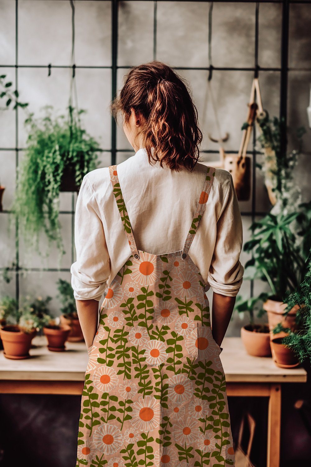
I was inspired to work with the Pantone Color of the Year with this design. Peach Fuzz is the color for 2024, so I wanted to create a color combination showcasing this scrumptious peachy color. This turned to be my favourite color way of the collection. That was a surprise to me.
A moody take on spring daisies with Benjamin Moore’s color of the year, Blue Nova.
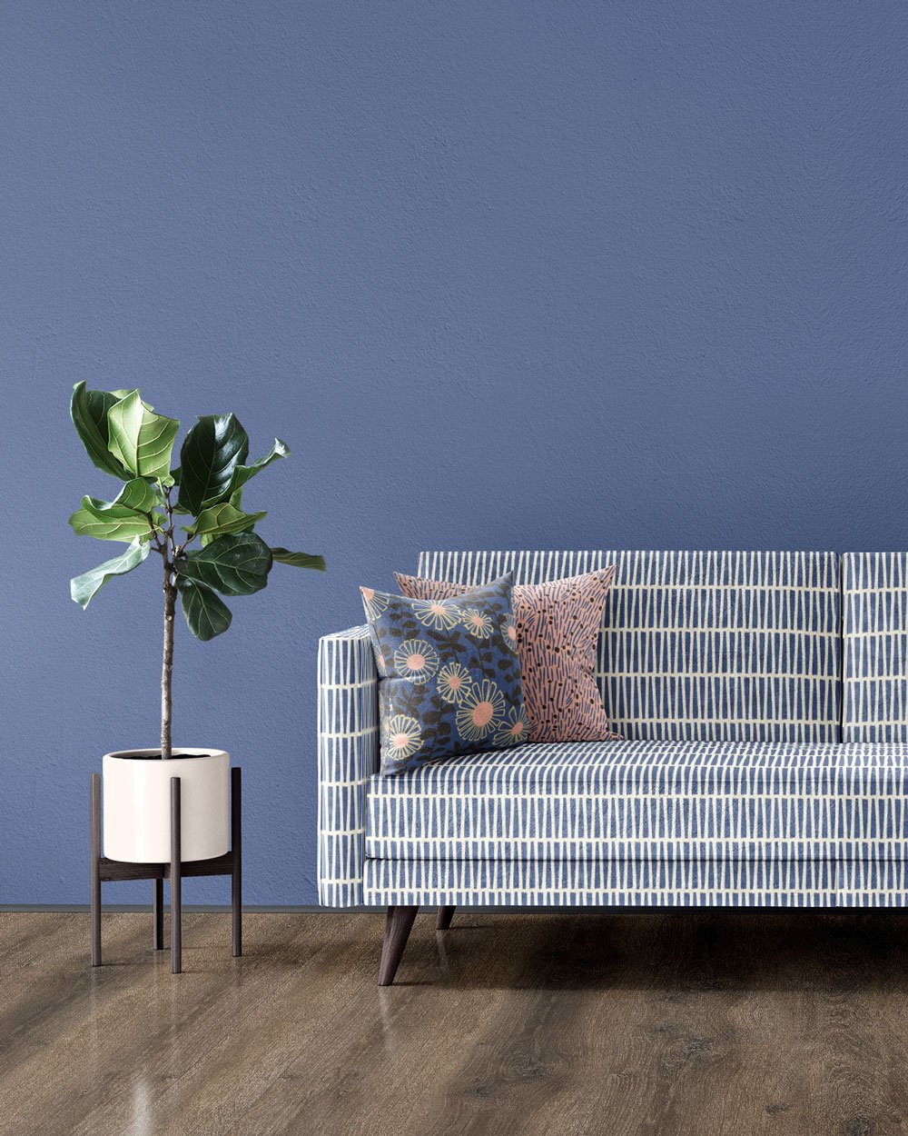
I also decided to create a design using Benjamin Moore’s color of the year, Blue Nova. I thought it was a good idea to create fabrics that could match and coordinate with currently trending interior paint colors. It was also super helpful to have some limitations when considering color. Without a specific color goal in mind, I found myself working myself into circles with all the endless possibilities of the rainbow.
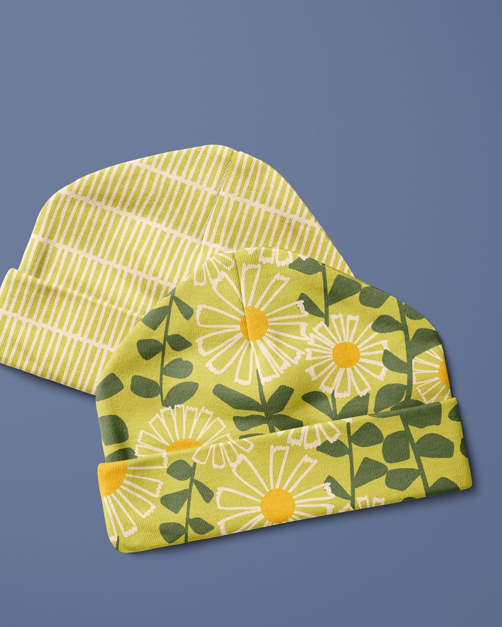
A somewhat vintage or retro vibe to this color combination.
With this final color combination, I tried to channel some vintage and retro vibes. I really love that dark green, specially alongside the citron yellow.
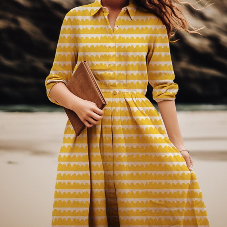
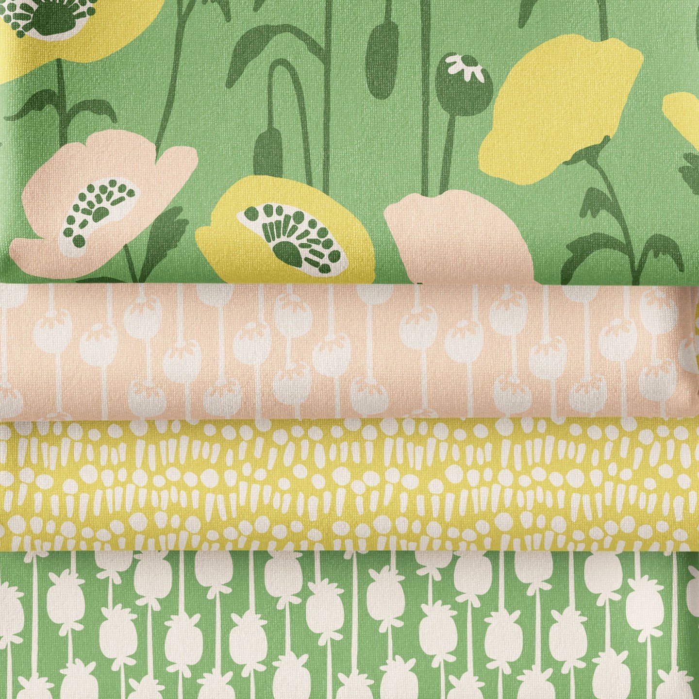
Another great part of working with mock-ups is that it helps me to work on scale relationships between the designs. It is also very helpful to see how the designs work differently on different products. And most of all, it is super fun and satisfying seeing the designs on products. Here are a few product mock-ups that make me happy.
As of today, these designs are available on my SPOONFLOWER shop where you can get not only fabric but also some home decor items like tea towels and napkins and table clothes. Be sure to check it out, and If you don’t end up shopping yourself, please heart your favorites in my shop . It really helps others find me amongst all the amazing designs available. Thanks!
